B&W or Colour?

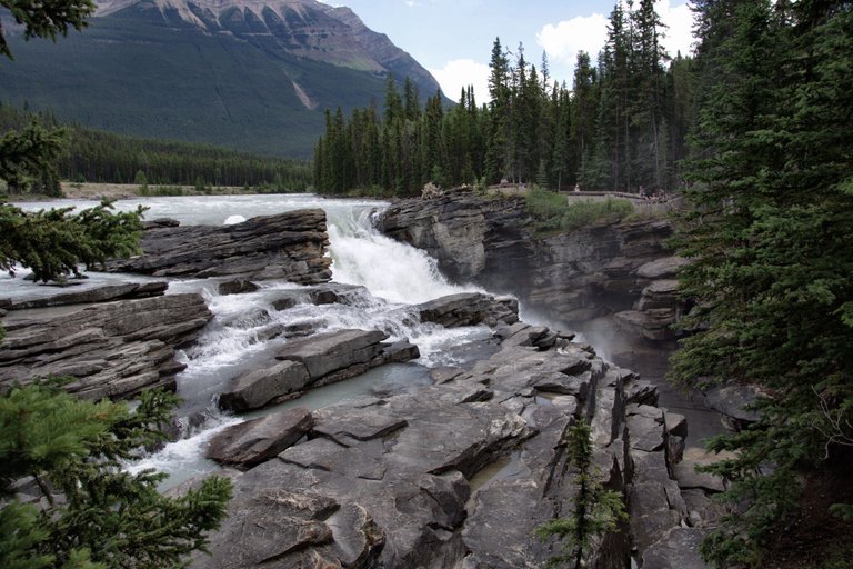
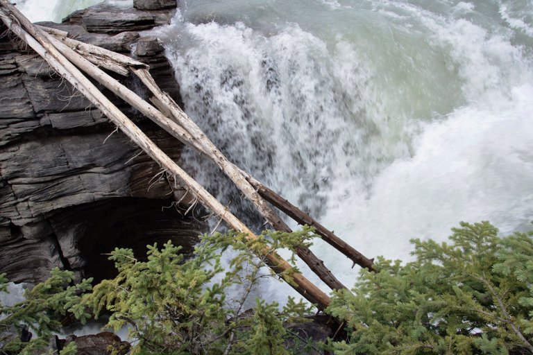
Both photos were captured at Athabasca Falls, Jasper National Park. If you find yourself driving between the town of Jasper and Lake Louise, you will definitely need to stop by the falls and take in this amazing creation! A Sony A77 and DT 16-105mm lens was used. Which do you prefer, B&W or Colour?
========================================
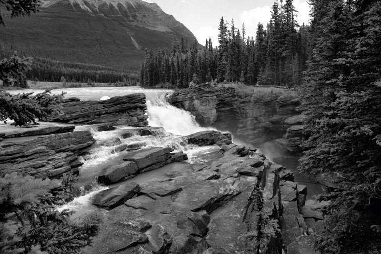
ISO 100 ~ f/5.6 ~ 16mm
========================================
========================================
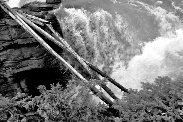
ISO 100 ~ f/3.5 ~ 16mm
========================================
========================================


Thanks to @papa-pepper for creating these logos for @daveks!
0
0
0.000
Thanks for your work @daveks Followed...
Thanks for the follow!
Difficult choice, as they're all very striking. If I had to choose, I'd go with black and white for these. :)
Thanks for coming @tinajordan!
Color on the first one, second one’s a tossup.
they look such powerful and beautiful falls quite spectacular
It's an incredible place to visit, quite loud too!
They are different. First set I prefer colorful, second set contains completly different photos
Thanks for looking!
beautiful natural landscape I suppose you felt moved by the majestuosidad of the nature I follow you, follow me to continue enjoying your post,
wow... this is beautiful
First colorful, second b&w
Thanks for your opinion @helenril!
first one black and white, second colour.
That's kind of the way I was leaning!
Thanks @countrygirl
Well I think I like it more with color, it's nature and we like its bright colors.
Greetings.
I get that!
Thanks for stopping by
I like both. For example, in the first scene, the b&w emphasizes the hard edges in the rocky foreground. The softer forest and water looks better in the colour shot.
I wouldn't fancy trying to cross those logs in the second scene :-)
Not unless you have a death wish!
Thanks for your comments!
When it comes to nature and places, I always choose colored to enchance the view. But all of these works are good in the eyes.
B&W
I figured you might say that!
😜
So amazing to visit your blog...wonderful images really like them
In my opinion I like the first one as black and white whereas the 2nd one the color is much better. Bde both the photos looks great
Thanks for dropping in @codingdefined!
Think I have to go straight ticket black and white for this one! Very nice work!
Thanks Jed!
Color for both. The tones on the rocks and trees are too close in B&W and make it hard to distinguish them. You could adjust the tones to lighten your greens to make the plants stand out in the B&W photos.
As first - all four pictures are good, I like them very much.
First picture I like more as BW version, it's more dramatic that way.
Second picture I like more as color version since BW is a little bit flat.
But if you want to make further progress, I encourage you to step into post processing world. Since you are using Sony, most likely you have free license for Capture One. Phase One have contract with Sony and they give one free license with any Sony cameras. Or simply try Adobe Lightroom, it's free trial for month, and quite cheap if you decide to use it regularly - cloud subscription is only $9 per month or less.
As a example look at before and after work on one of my photos. Edited version has much more depth and dynamic and it is much more appealing to eye, and I even removed distracting elements (yep it's people) ;)
What you could do with those pictures using post processing is magic. As little as putting down highlights and opening shadows will give much more dynamic and another dimension to your photos.
Keep a good work friend!
Thanks for the detailed information!
don't ask me cos you know :-)
Yup!